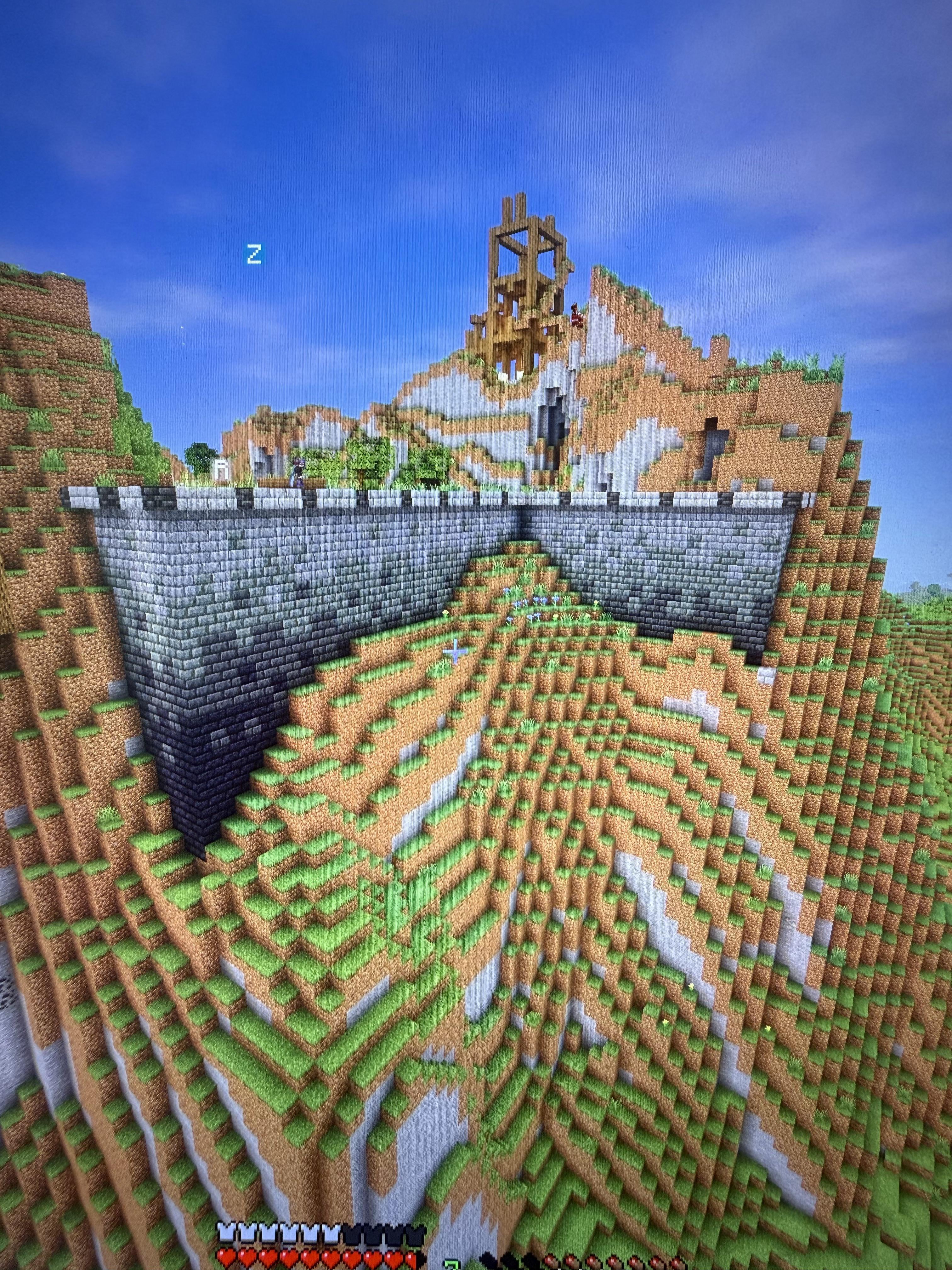
Kinda looks like something from a NES game (in a good way)
Maybe make the white parapets (things at the top) a bit more of a neutral/darker color?
KvitekStromek on
I think the color change is too big for the size of your wall. Either start from slightly lighter colors, or end in darker ones. (I honestly do not like the tuff bricks, but that is highly subjective)
Emmie_xoxo_ on
Tbh I think it looks pretty good I’d be very happy with it
Deadog103 on
I think it needs more texture. Like some tuff blocks, stone, maybe come cobble
ToxicTrooper449 on
Personally its looks kinda flat with no depth, perhaps try adding like a tower or some shi in the corners or like a protruding pillar, almost like a castle has where its not a tower but just an extension of the walk way, i forgot what its called.
Also maybe play around with the terrain if you want🤷
Ok_Minimum_3941 on
Add some broken bricks and or mossy stone if you want
epicdavey on
Add more detailing around the landscapes. Such as different stone buttons as pebbles or stone on the ground and mix in grass block with moss block for more visual appearance
jojowiese on
I agree with the other guy, the gradient is too drastic imo, maybe remove the one at the very bottom, sometimes less is actually more

8 Comments
Kinda looks like something from a NES game (in a good way)
Maybe make the white parapets (things at the top) a bit more of a neutral/darker color?
I think the color change is too big for the size of your wall. Either start from slightly lighter colors, or end in darker ones. (I honestly do not like the tuff bricks, but that is highly subjective)
Tbh I think it looks pretty good I’d be very happy with it
I think it needs more texture. Like some tuff blocks, stone, maybe come cobble
Personally its looks kinda flat with no depth, perhaps try adding like a tower or some shi in the corners or like a protruding pillar, almost like a castle has where its not a tower but just an extension of the walk way, i forgot what its called.
Also maybe play around with the terrain if you want🤷
Add some broken bricks and or mossy stone if you want
Add more detailing around the landscapes. Such as different stone buttons as pebbles or stone on the ground and mix in grass block with moss block for more visual appearance
I agree with the other guy, the gradient is too drastic imo, maybe remove the one at the very bottom, sometimes less is actually more