There were people who complained that brightly colored blocks are harder to incorporate into builds.
If Mojang catered to them every time new blocks were added we wouldn’t have stuff like Crimson, Warped, or Cherry wood or literally anything that doesn’t explicitly fit with “sophisticated“ Spruce or Deepslate builds.
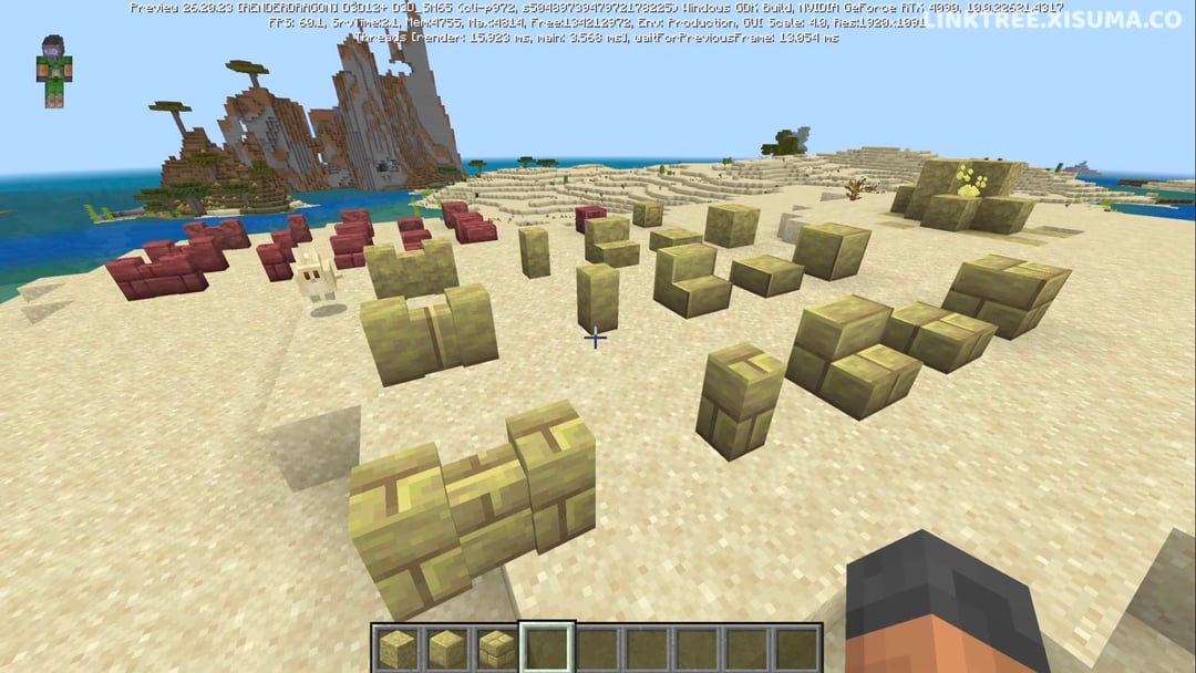
Cinnabar is now too similar to Mangove and Sulfur is too similar to Endstone.
Manaea on
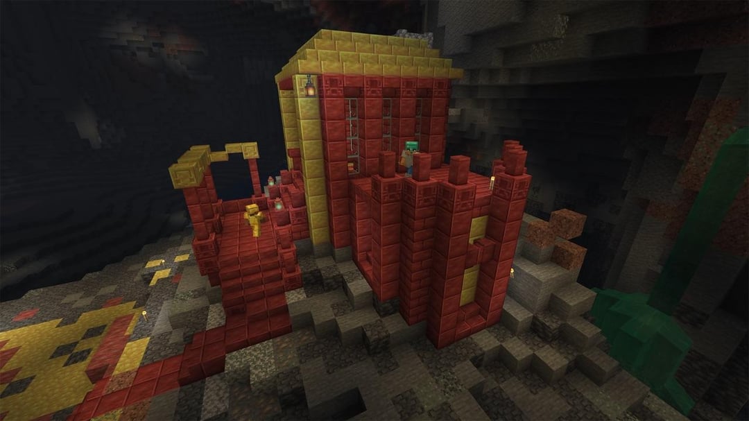
The surrounding environment of the blocks has a huge effect on how they are perceived, of course they’re gonna look desaturated if you place them surrounded by very bright blocks. I bet they would look like the first picture if you were to place them in a cave
Birdy_King2000 on
Least it will look good for sandstone blocks
PhiStudios_ on
??? I liked the original give me back ketchup and mustard
TechnicianAny8605 on
Watch people defend this like their life depends on it.
Luutamo on
Sulfur looked way too much like gold before. Now it’s a nice in-between gold and sandstone
[deleted] on
[deleted]
Renzy_671 on
I would prefer the middle of the two. They were too bright the first time but now they’re way to dull.
Dannypan on
Oh I love it, the natural blocks will work better in landscaping.
22Amster on
I kind like it imo this game is in dire need of more beige blocks I always think this when trying to build European stuff . I have also being craving a beige dye since basically forever but I know they won’t do that
Dangerous-Quit7821 on
I fucking love it lol. People bitched and moaned that they were too bright and saturated now that they desaturated it and toned it down now people are going to bitch and moan that they’re now less bright and desaturated. They literally cannot win.
Content-Example-8763 on
I personally dont like using saturated blocks in Minecraft because it always looks out of place to me.
Reloup38 on
I really like the new colors… More realistic and goes everywhere, the old ones were way too saturated
MrZao386 on
Yep, was very excited for the bright red cinnabar. Still might use it though
SmoothAssistance1122 on
First, it was catsup- and mustard-coloured; now, ’tis p*ss- and blood-coloured!
playeractivity on
Guys we got sandstone 2
gkgftzb on
100% sure or is it Vibrant Visuals vs Vanilla shaders? Vibrant tends to change colors wildly
The-lego-conquere on
I am very disappointed. I really liked the idea of using sulfur as gold bricks, and cinnabar… I didn’t have any specific plans for it, but I really liked how it looked.
Sulfur just looks like sandstone and endstone. It doesn’t look bad per say, but it looks boring, and it’s new colour already exists in the game, with very similar textures (the bricks look like endstone bricks, and the polished just kinda looks like cut sandstone.)
I really liked that they were shiny, I thought they looked like pained metal. Now they look a lot more stony, which is accurate but very boring.
NeonFraction on
They absolutely did not, imo. Now these blocks are actually useful. What would you have even used the other ones for? Making a McDonalds?
fredbite87 on
Looks almost identical to end stone bricks
Camelback186 on
Welcome back bamboo and mangrove lol
bostar-mcman on
Is a shame the ketchup and mustard combo was one thing I was looking forward to.
PumpkinKing_0922 on
I feel like it looks even better now than the Minecraft Live
Responsible-Trifle93 on
That’s the main problem when it comes to listening to the community; you don’t know which part of the community you want to please.
SamohtGnir on
The look like a mix between sandstone and end stone. They’ll probably blend a lot better, but having them pop more would be nice.
J3sperado on
Wow, super boring now
NoOne_TheAlchemist on
idk why but the polished sulfur wall reminds me of CS 1.6 Dust II walls now
okiedokieophie on
McDonald’s 15 years ago vs McDonald’s now
1sk1_1 on
I think they can work with mangrove after seeing them in person they don’t work as well as I thought, I think it would be better if they could somehow balance them in the middle between a brighter red like the original and something like mangrove because they look a bit too pink and a little desaturated, that way we get the best of both worlds
Although as a builder I need a wall close to mangrove, I literally need this rn
mono8321 on
I think people complained that the colors were too close to stripped bamboo and mangrove in color. I don’t care for the change. But I can see why they did it
NameNomad on
I actually love these now. I’ve always wanted a sandstone color for bricks (cause real castles are built like that) and never had a good block. These are perfect for that.

31 Comments
There were people who complained that brightly colored blocks are harder to incorporate into builds.
If Mojang catered to them every time new blocks were added we wouldn’t have stuff like Crimson, Warped, or Cherry wood or literally anything that doesn’t explicitly fit with “sophisticated“ Spruce or Deepslate builds.
Cinnabar is now too similar to Mangove and Sulfur is too similar to Endstone.
The surrounding environment of the blocks has a huge effect on how they are perceived, of course they’re gonna look desaturated if you place them surrounded by very bright blocks. I bet they would look like the first picture if you were to place them in a cave
Least it will look good for sandstone blocks
??? I liked the original give me back ketchup and mustard
Watch people defend this like their life depends on it.
Sulfur looked way too much like gold before. Now it’s a nice in-between gold and sandstone
[deleted]
I would prefer the middle of the two. They were too bright the first time but now they’re way to dull.
Oh I love it, the natural blocks will work better in landscaping.
I kind like it imo this game is in dire need of more beige blocks I always think this when trying to build European stuff . I have also being craving a beige dye since basically forever but I know they won’t do that
I fucking love it lol. People bitched and moaned that they were too bright and saturated now that they desaturated it and toned it down now people are going to bitch and moan that they’re now less bright and desaturated. They literally cannot win.
I personally dont like using saturated blocks in Minecraft because it always looks out of place to me.
I really like the new colors… More realistic and goes everywhere, the old ones were way too saturated
Yep, was very excited for the bright red cinnabar. Still might use it though
First, it was catsup- and mustard-coloured; now, ’tis p*ss- and blood-coloured!
Guys we got sandstone 2
100% sure or is it Vibrant Visuals vs Vanilla shaders? Vibrant tends to change colors wildly
I am very disappointed. I really liked the idea of using sulfur as gold bricks, and cinnabar… I didn’t have any specific plans for it, but I really liked how it looked.
Sulfur just looks like sandstone and endstone. It doesn’t look bad per say, but it looks boring, and it’s new colour already exists in the game, with very similar textures (the bricks look like endstone bricks, and the polished just kinda looks like cut sandstone.)
I really liked that they were shiny, I thought they looked like pained metal. Now they look a lot more stony, which is accurate but very boring.
They absolutely did not, imo. Now these blocks are actually useful. What would you have even used the other ones for? Making a McDonalds?
Looks almost identical to end stone bricks
Welcome back bamboo and mangrove lol
Is a shame the ketchup and mustard combo was one thing I was looking forward to.
I feel like it looks even better now than the Minecraft Live
That’s the main problem when it comes to listening to the community; you don’t know which part of the community you want to please.
The look like a mix between sandstone and end stone. They’ll probably blend a lot better, but having them pop more would be nice.
Wow, super boring now
idk why but the polished sulfur wall reminds me of CS 1.6 Dust II walls now
McDonald’s 15 years ago vs McDonald’s now
I think they can work with mangrove after seeing them in person they don’t work as well as I thought, I think it would be better if they could somehow balance them in the middle between a brighter red like the original and something like mangrove because they look a bit too pink and a little desaturated, that way we get the best of both worlds
Although as a builder I need a wall close to mangrove, I literally need this rn
I think people complained that the colors were too close to stripped bamboo and mangrove in color. I don’t care for the change. But I can see why they did it
I actually love these now. I’ve always wanted a sandstone color for bricks (cause real castles are built like that) and never had a good block. These are perfect for that.