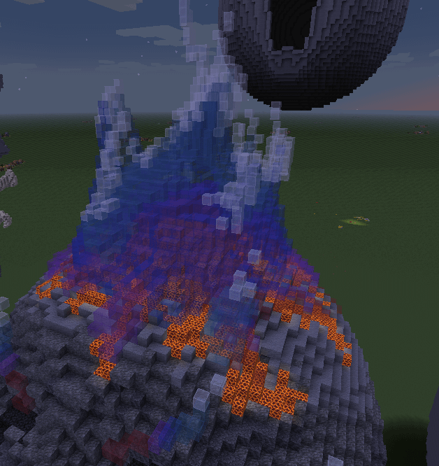
I’m not the best at detailing stuff myself, so this one’s a bit of a shot in the dark: maybe something like small specks of smoke above using a mix of tinted glass, along with grey, light grey, and black stained glass?
*adding one small thing, maybe a couple other smaller spikes/wisps of flames around the rest?
Also this is an unrelated thing but that palette looks like it’d be amazing as part of an aurora design.
Disastrous_Debt7644 on
-Make more flame peaks (?) and make them a bit more wiggly
-Layer some white/light blue glass within to make it foggier
-Add sea lanterns inside behind some of the glass layers
Felsys1212 on
I like the blue but blue (as you probably know and why you chose it) is the hottest part of the fire next to white and clear. Some yellow and red near the base and with their own small peaks might help sell the fire. Even if not and you keep your palette as is, some smaller peaks around the side would look good. Fire is chaos and has many little peaks.

4 Comments
can i see from another angle? cuz this looks sick
I’m not the best at detailing stuff myself, so this one’s a bit of a shot in the dark: maybe something like small specks of smoke above using a mix of tinted glass, along with grey, light grey, and black stained glass?
*adding one small thing, maybe a couple other smaller spikes/wisps of flames around the rest?
Also this is an unrelated thing but that palette looks like it’d be amazing as part of an aurora design.
-Make more flame peaks (?) and make them a bit more wiggly
-Layer some white/light blue glass within to make it foggier
-Add sea lanterns inside behind some of the glass layers
I like the blue but blue (as you probably know and why you chose it) is the hottest part of the fire next to white and clear. Some yellow and red near the base and with their own small peaks might help sell the fire. Even if not and you keep your palette as is, some smaller peaks around the side would look good. Fire is chaos and has many little peaks.