
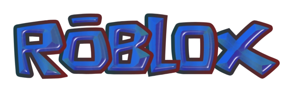
I made this ROBLOX logo which is the old logo but with a 3D effect, thought I'm not really proud of this one personally, I don't think it turned out good. I'll be trying better next time i make those, tell me what kinda logo i should be making next (Roblox related, just in any logo's font really. I like giving it this 3d effect)
by Opposite-Shoulder997
14 Comments
Yes. Anything but whatever is it now.
yea bro it looks like Roblox instead of a corporate company that just wants profits.
im gonna be sincere, i dont really like this logo, ig the best option would’ve been sticking with the funky red logo
maybe if it wasnt blue
Get that blue off, theeeeen I’ll prefer it.
Hell no look the old logos have their charm but we need something completely new instead of a recolor of them
Ngl i hate it
No the text looks like gushers
Why does the O have a Japanese accent over it?
if its the original logo yes because it looks more lively
This would look good with a blue outline instead imo
The colors do not work well together at all
I think the original colors and a simple gradient effect would be cool, this is a bit much imo
Why are you blue?