
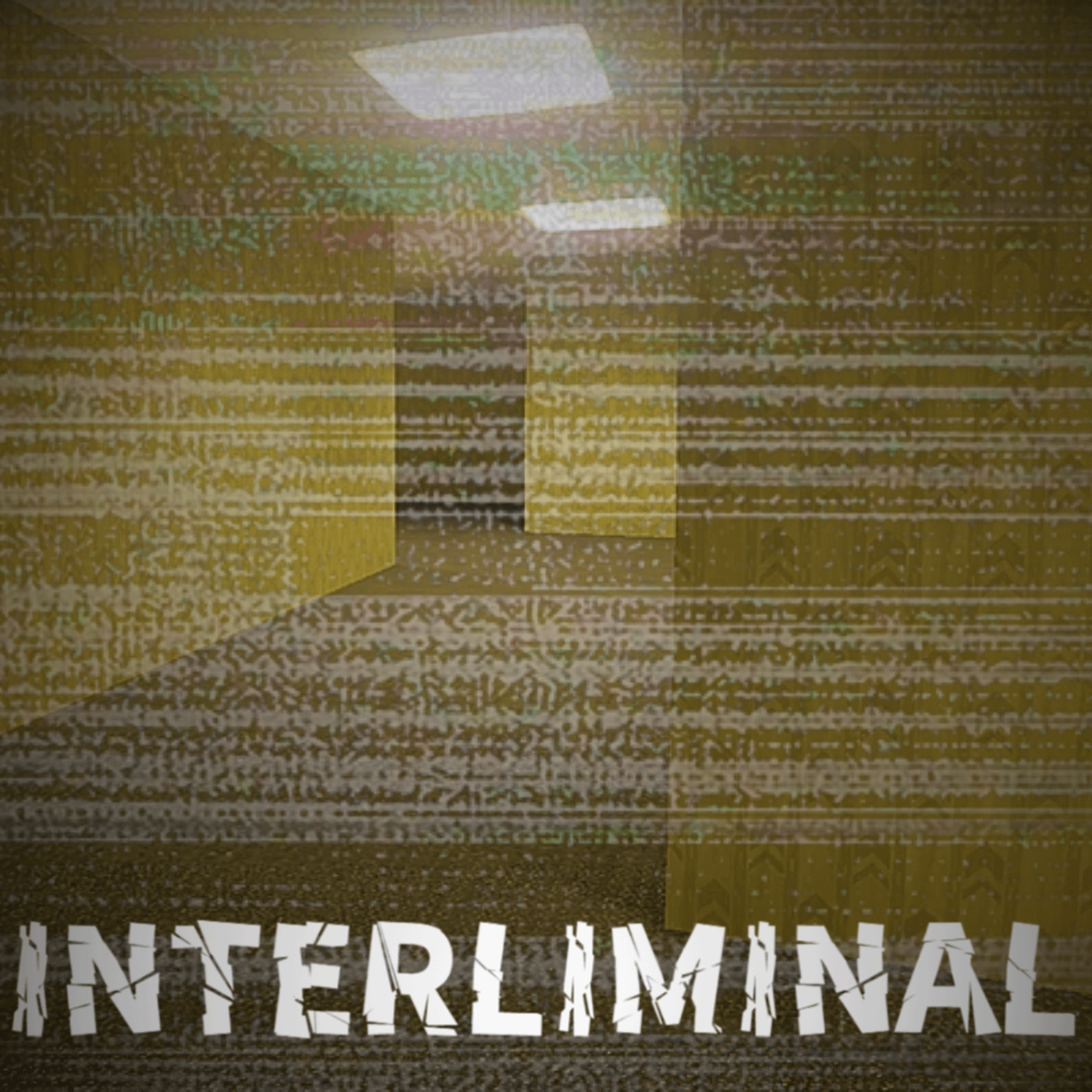
I've been working on a side project which is a liminal explorer game. I came up with this cover art for it. Tell me what you think could be improved!
by XenoFox13
I've been working on a side project which is a liminal explorer game. I came up with this cover art for it. Tell me what you think could be improved!
by XenoFox13
4 Comments
could definitely use some filters such as sepia, or grayscale, and maybe add a smaller font (or a nother variation of your font)
however its nice for now
good but maybe you could change the name cus there’s already a game called interliminality
A little too much effect overlay, maybe make it a little less opacity. And have the name in the middle or closer to the middle of the image and add some form of outline to make the name stand out
When is the release date? or is it released already?