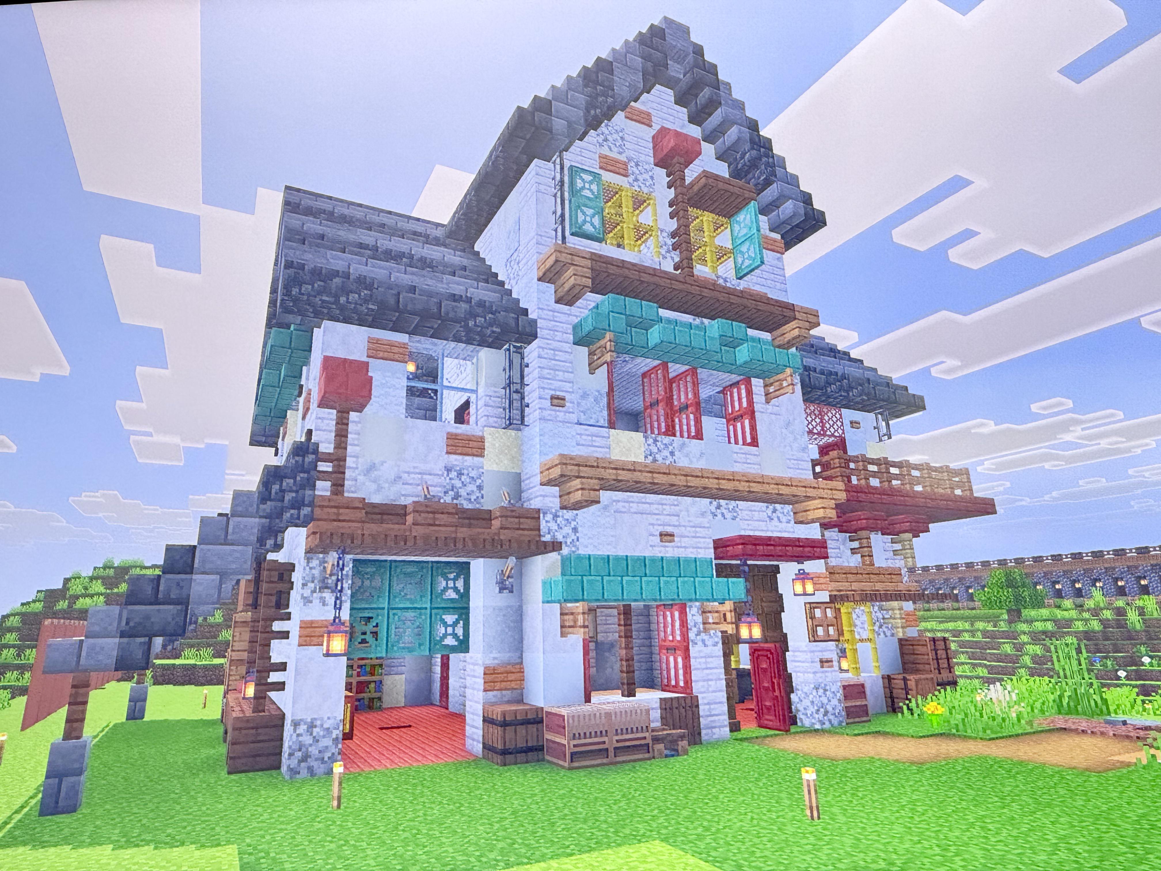
Although it looks amazing, it’s extremely busy and it took a while for me to figure out what I was looking at. I feel that removing most of the buttons and the signs, and the trapdoors, and the stairs, and the fence posts that are on the wall would make the build a bit simpler and cleaner.
Instead, I think that rather than placing blocks randomly, you should focus on more specific details, like vents or electrical things or something.
CauliflowerCrafty644 on
I’d say fade your gradients/ texture better, and don’t overuse it like on the fence (or do you might think it looks cool) and I would also stick to a slightly stricter colour pallet on details like windows and doors. This is a great build that’s just what I’d do differently!

2 Comments
Although it looks amazing, it’s extremely busy and it took a while for me to figure out what I was looking at. I feel that removing most of the buttons and the signs, and the trapdoors, and the stairs, and the fence posts that are on the wall would make the build a bit simpler and cleaner.
Instead, I think that rather than placing blocks randomly, you should focus on more specific details, like vents or electrical things or something.
I’d say fade your gradients/ texture better, and don’t overuse it like on the fence (or do you might think it looks cool) and I would also stick to a slightly stricter colour pallet on details like windows and doors. This is a great build that’s just what I’d do differently!