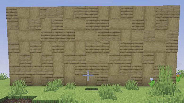
I think this would look better as a floor design tbh
HospitalTall on
I don’t think it looks bad, but maybe see what it’s like doing a 75/25 split between the blocks rather than a 50/50 split. Take away some of the planks to give it a bit more room maybe?
But also, if you like the look of it that’s all that matters.
DragonFruwut on
I’ve noticed that texturing looks better in chunks and not as noise/ dithering. Think of it as wear on the surface on certain spots that make sense rather than trying to break up wall with variation if that makes sense. But it doesn’t look bad, it could look intentional but would depend on the context of the build.
jankoissucks on
Pillars make everything look better
TIMBER_WOLF_17 on
Yes.
BoyceMC on
What are you going for?
These two blocks share the same hues but are texturally very different. With intentional design, they can make for a nice blend. But if you’re just mixing them for variety, it is a messy look
KaleidoscopeCurrent6 on
How about keeping one orientation. For the stripped logs either vertical or horizontal cause now I am getting eye strain looking at it ( I don’t want to be rude I actualy am having it. )
Crazy-Yesterday-3052 on
Could you try birch planks instead of the stripped logs maybe? I know it’s very similar to oak. I make a lot of cross shapes, L shapes, Z shapes. Good luck!
McNanas on
I would recommend having your stripped logs all face the same direction to keep it looking like pieces have stripped off! I always HAVE to have them going up and down or else I can’t stand it (bonus points for stripped wood, as in all 4 sides are bark, when making the windows)!
Tight-Resolution2306 on
Nice
Bazillion100 on
These posts are the worst
MisterMonsiuer on
I think just realign the stripped logs so they’re all lateral?
Torriderro on
i see a wall built with 2 different blocks and im already scared its loss
Eaglefrost4 on
Go for shadows or blobs
HamshanksCPS on
I’m of the opinion that most texturing looks bad
Pichacap24 on
Try making splooges instead of dots and fuzz
New_Educator_4988 on
It looks bad. I don’t really mix logs with planks on a flat surface at all. Try something else
VrLights on
Rotate the logs instead of using planks
Shadiest_Pastry on
You have a good idea, but the shapes should be larger. It looks like random placement and comes off as noise. Separating it into larger chunks or putting the darker texture at the bottom/corners/under the eaves of a roof makes it look like shadow/grime/weathering and is easier on the eyes.
Another reason it might look harsh is that instead of picking a block with a slightly different hue (the color), saturation (if there’s any gray mixed in), or value (brightness) you chose a busier texture of the same block. It sounds complicated but it helps to think about changing one of those components at a time.
Busy/random textures work better as floors for some reason so this would be a fine floor.

20 Comments
I think this would look better as a floor design tbh
I don’t think it looks bad, but maybe see what it’s like doing a 75/25 split between the blocks rather than a 50/50 split. Take away some of the planks to give it a bit more room maybe?
But also, if you like the look of it that’s all that matters.
I’ve noticed that texturing looks better in chunks and not as noise/ dithering. Think of it as wear on the surface on certain spots that make sense rather than trying to break up wall with variation if that makes sense. But it doesn’t look bad, it could look intentional but would depend on the context of the build.
Pillars make everything look better
Yes.
What are you going for?
These two blocks share the same hues but are texturally very different. With intentional design, they can make for a nice blend. But if you’re just mixing them for variety, it is a messy look
How about keeping one orientation. For the stripped logs either vertical or horizontal cause now I am getting eye strain looking at it ( I don’t want to be rude I actualy am having it. )
Could you try birch planks instead of the stripped logs maybe? I know it’s very similar to oak. I make a lot of cross shapes, L shapes, Z shapes. Good luck!
I would recommend having your stripped logs all face the same direction to keep it looking like pieces have stripped off! I always HAVE to have them going up and down or else I can’t stand it (bonus points for stripped wood, as in all 4 sides are bark, when making the windows)!
Nice
These posts are the worst
I think just realign the stripped logs so they’re all lateral?
i see a wall built with 2 different blocks and im already scared its loss
Go for shadows or blobs
I’m of the opinion that most texturing looks bad
Try making splooges instead of dots and fuzz
It looks bad. I don’t really mix logs with planks on a flat surface at all. Try something else
Rotate the logs instead of using planks
You have a good idea, but the shapes should be larger. It looks like random placement and comes off as noise. Separating it into larger chunks or putting the darker texture at the bottom/corners/under the eaves of a roof makes it look like shadow/grime/weathering and is easier on the eyes.
Another reason it might look harsh is that instead of picking a block with a slightly different hue (the color), saturation (if there’s any gray mixed in), or value (brightness) you chose a busier texture of the same block. It sounds complicated but it helps to think about changing one of those components at a time.
Busy/random textures work better as floors for some reason so this would be a fine floor.
Use beehive crate things and signs