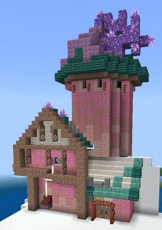
And this is why I don’t like the new meta for “good” building. What even is this block pallette?
Okay but genuinely first start with the shape. There’s no reason for the copper here to be a block out, that’s waaay too much depth for the effect you’re going for. It’s better in this case to just keep it all flat and add depth other ways like trapdoor/shelves for window shudders or something. Maybe some signs on horizontal logs to make them rounder.
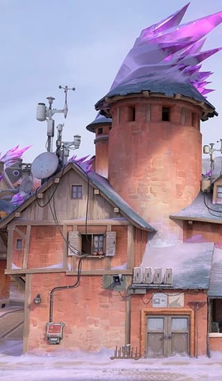
Speaking of horizontal logs, and going back to my block pallette comment… why on earth are you using copper blocks where something like stripped oak logs is both more realistic and closer to the reference image? Copper blocks look so much closer to the actual bricks on the tower too. It’s one thing if you wanted to make the tower pink instead (not many options for that unfortunately), but the picture definitely looks more orange to me.
And I think the final issue here is scale. Using blocks solely for their color and texture, painterly, really only works imo on things that are really big (so the textures and colors have a more gentle, natural gradient) and/or things meant to be seen from very far away (which bigger builds also typically are). To live in or around this build in survival you’d notice all the harsher contrasts in texture here that much more. I don’t know what your end goal for this build is, but either you plan to interact with it and the painterly style needs to be way toned down, or it needs to be stuck on a faraway mountain and never visited up close (and it probably wouldn’t hurt to make it even bigger to give a suggestion of greater detail from further away.
Sorry to have ranted a little bit, but I hope there IS some good advice in there for you.

1 Comment
And this is why I don’t like the new meta for “good” building. What even is this block pallette?
Okay but genuinely first start with the shape. There’s no reason for the copper here to be a block out, that’s waaay too much depth for the effect you’re going for. It’s better in this case to just keep it all flat and add depth other ways like trapdoor/shelves for window shudders or something. Maybe some signs on horizontal logs to make them rounder.
Speaking of horizontal logs, and going back to my block pallette comment… why on earth are you using copper blocks where something like stripped oak logs is both more realistic and closer to the reference image? Copper blocks look so much closer to the actual bricks on the tower too. It’s one thing if you wanted to make the tower pink instead (not many options for that unfortunately), but the picture definitely looks more orange to me.
And I think the final issue here is scale. Using blocks solely for their color and texture, painterly, really only works imo on things that are really big (so the textures and colors have a more gentle, natural gradient) and/or things meant to be seen from very far away (which bigger builds also typically are). To live in or around this build in survival you’d notice all the harsher contrasts in texture here that much more. I don’t know what your end goal for this build is, but either you plan to interact with it and the painterly style needs to be way toned down, or it needs to be stuck on a faraway mountain and never visited up close (and it probably wouldn’t hurt to make it even bigger to give a suggestion of greater detail from further away.
Sorry to have ranted a little bit, but I hope there IS some good advice in there for you.