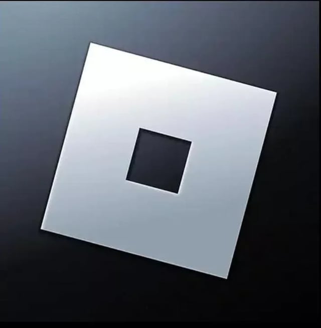
I feel like the last and the black backgroudn ones were the best
TheNarnit on
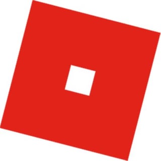
I don’t like how Roblox is turning blue, why is Roblox blue now!? ROBLOX IS RED!!! I will always associate Roblox with Red and NOTHING will ever change that
GlitchGD on
4 or 5 imo, but I think the best choice would be a new R logo in the style of 3.


27 Comments
3 4 and 5 are good, especially 5.
i liked images 4 and 5 a lot better quite frankly, not rly because of nostalgia, i just like the red better.
I don’t doubt this would be an unpopular opinion, but either the first, or fourth. Second looks bad, third looks atrocious, and fifth looks tacky.
3 and 4 because 2 is too shiny, the 1st is self explanatory
The gray before David fucked it’s right little hole
despite all those garbage updates, current logo is cool and i like it
Got adapted to the blue one, the blue one looks better and more appealing to the eye so blue
5 without the circle background, it just screams roblox y’know the square just feels so corporate
3rd one, maybe bc i don’t like flashy thing
Last logo definitely. Never got the appeal of a square with a hole in it, nor the message it’s trying to convey.
The last, only true logo
2, 3, 4 because I’m not OG👍
3 and 4 on top too be fr
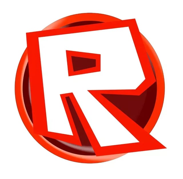
R (last one) no diffs
coughing baby, coughing baby, coughing baby, coughing toddler, hydrogen bomb
Tbh all of them are meh the last one is ok
the 4th one, it gives me nostalgia
number 5 but 4 is alright
I’ll always miss the original R 🙁
call me crazy but i like 3
Blue and red
I feel like the last and the black backgroudn ones were the best
I don’t like how Roblox is turning blue, why is Roblox blue now!? ROBLOX IS RED!!! I will always associate Roblox with Red and NOTHING will ever change that
4 or 5 imo, but I think the best choice would be a new R logo in the style of 3.
I really like the shade of blue on the first one.
1 • No one likes the current one
2 • Maybe better, but still buns
3 • Same as ^^^
4 • I’d rather use the 2023 one
5 • Easy smash, next one
first logo